
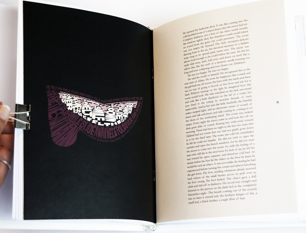
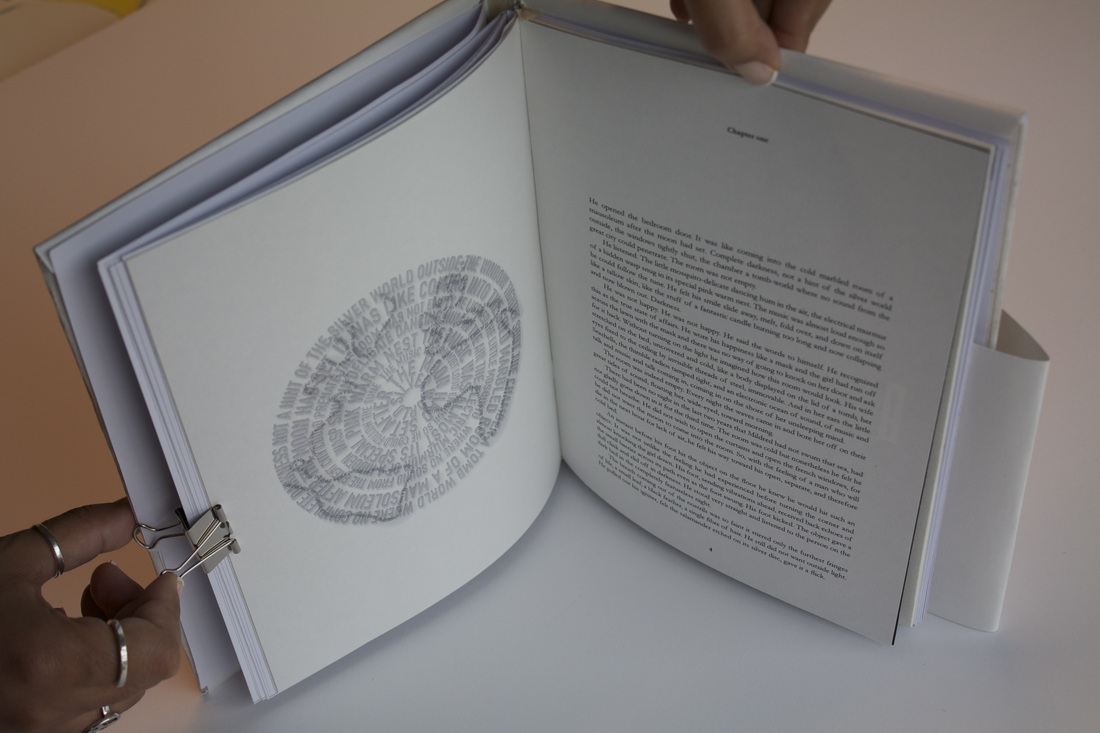
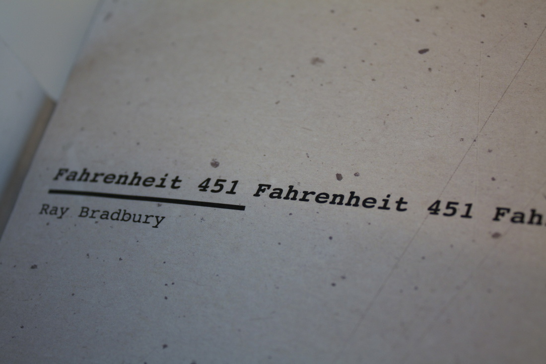
“Like a body displayed on the lid of a tomb, her eyes fixed to the ceiling by invisible threads of steel.” We were given a page of the book “Fahrenheit 451” with out us knowing which book we were reading. The task was to produce three illustrations based on three different emotions: happy, sad and neutral, and inspired by the text we were given. The illustrations were for the book and we were only allowed to use typography.
...
...
This task was mainly about showing our skills in Adobe Illustrator. The assignment was to choose a song and create an illustration inspired by it, only using Illustrator. I chose the song "Get Free" by Major Lazer


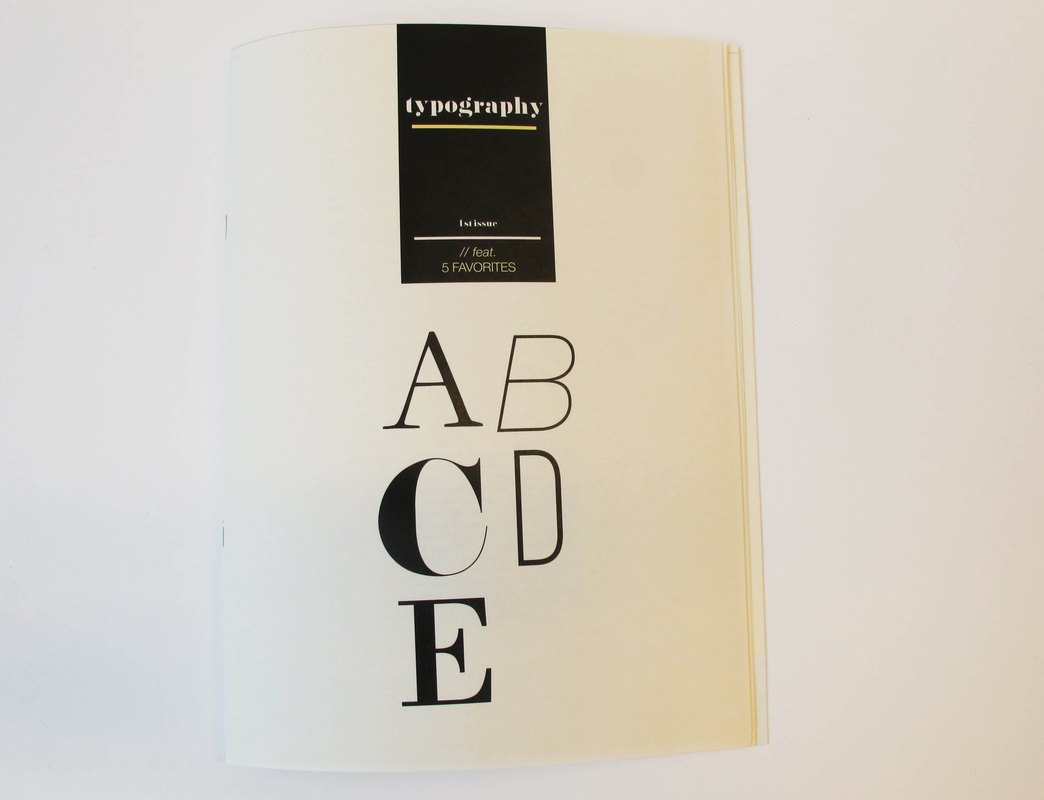
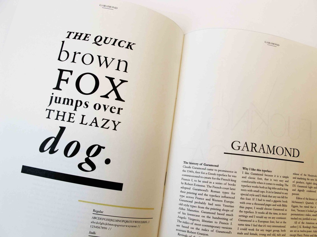
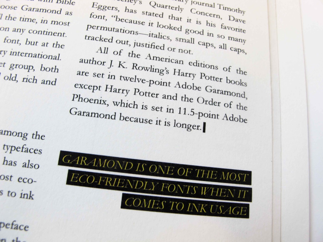
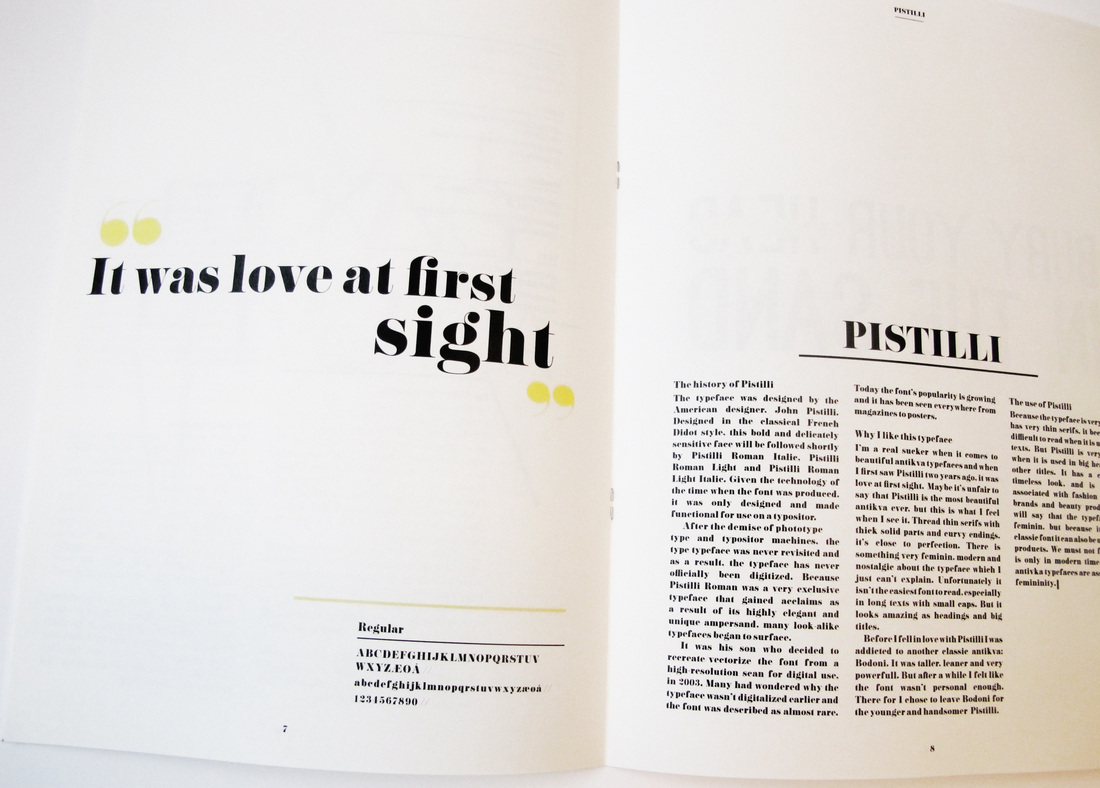
One of my favourite projects we had during our first year. The task was to create a mini magazine for five typefaces of our own choosing. I chose five typefaces that I love and often use. We were not allowed to use any illustrations or photos, only typography.


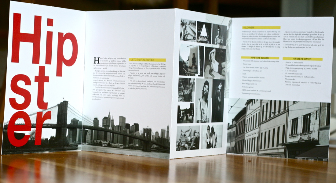
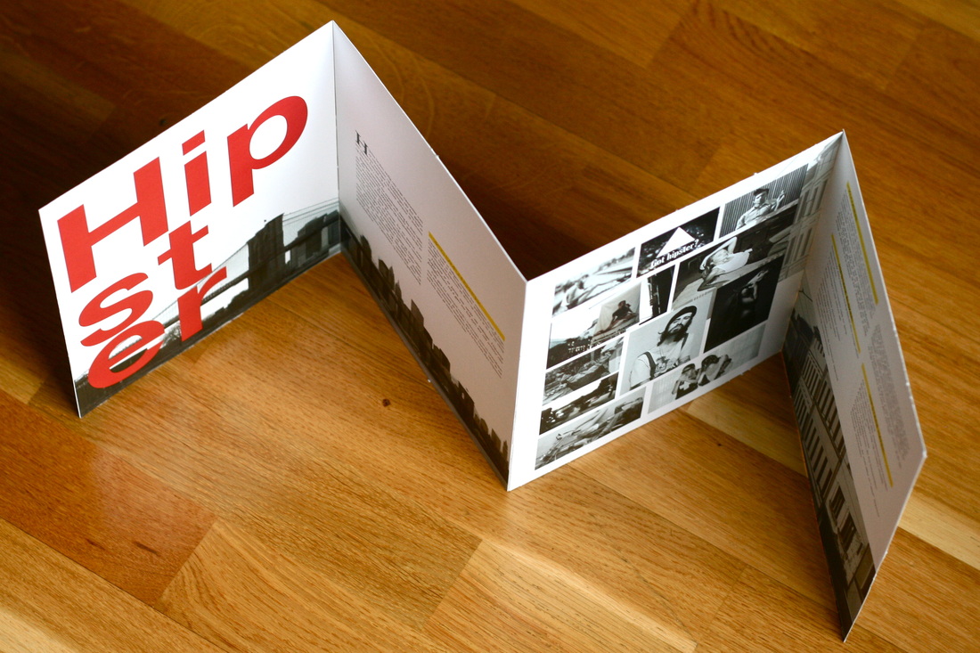
A fictional brochure for Visit Norway with the sub culture "hipsters" as the theme.

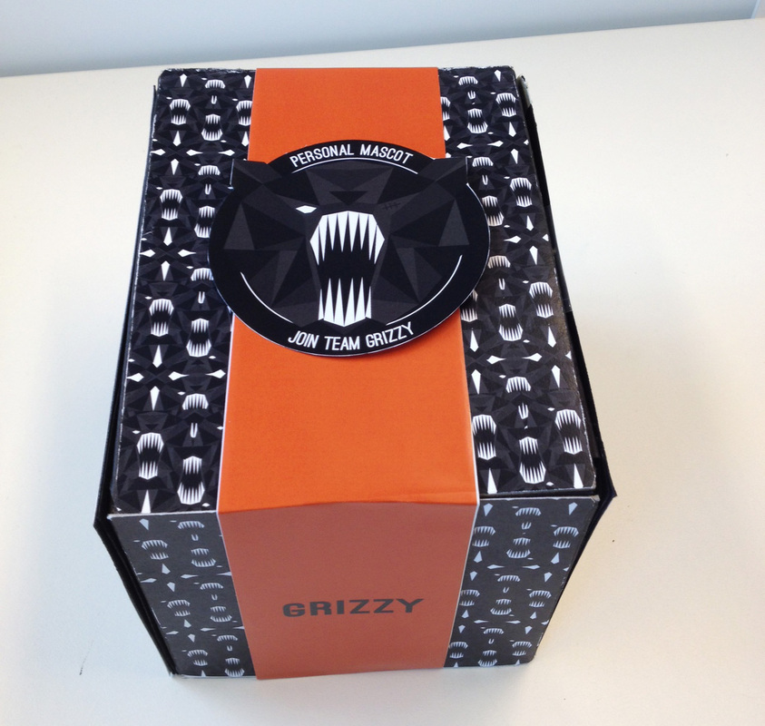
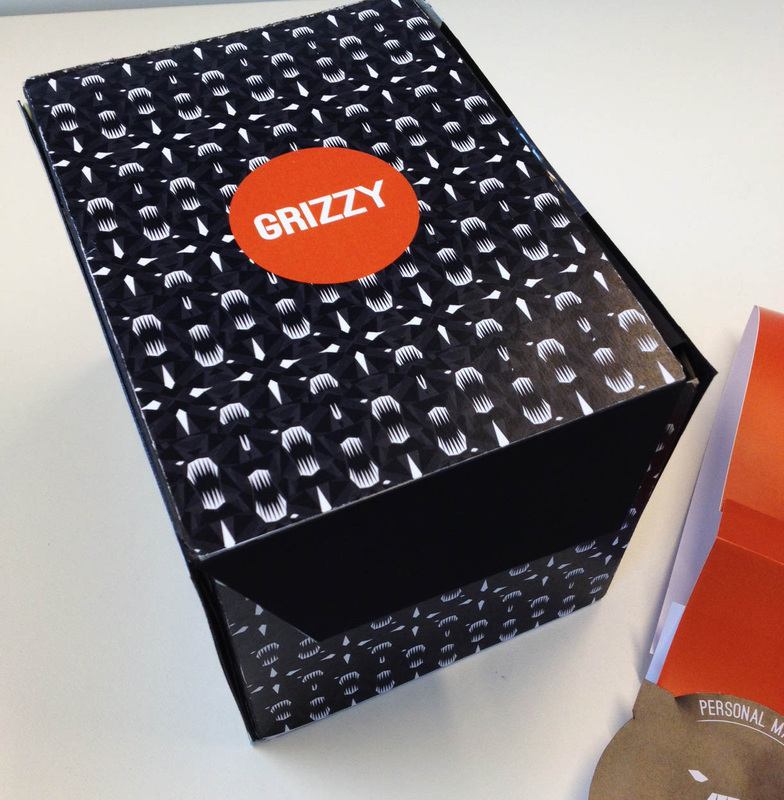
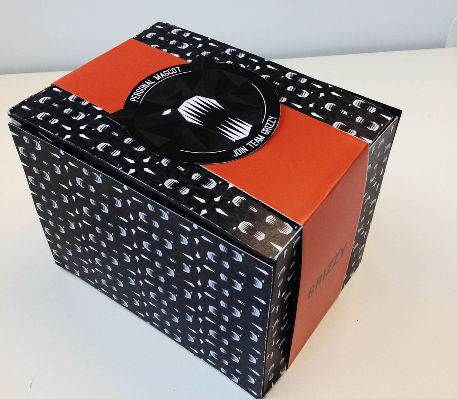
During our first year at Westerdals we had a one-year project where we would work with our own personal mascot. One of the things we worked on was packaging and here you can see my mascots package. My core values were strong, fearless, confident and helpful.
Another part of the mascot project was to create an animation for our mascot. This was my first time ever using Motion or any other animation program for that matter. The animation is a promotion video / commercial for the mascot.
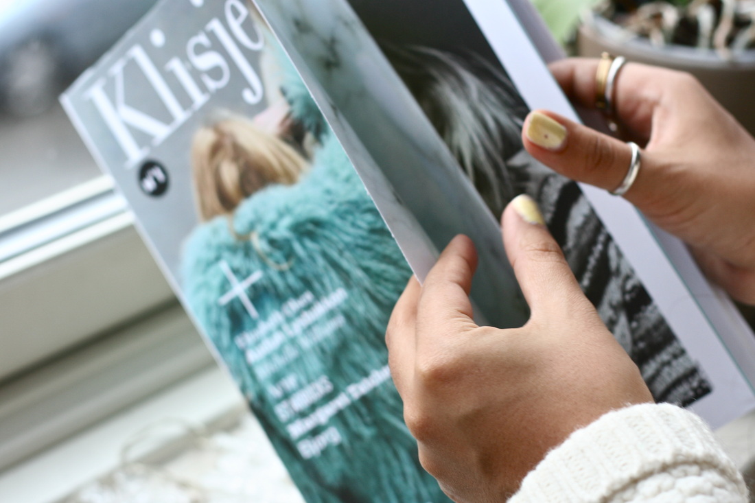
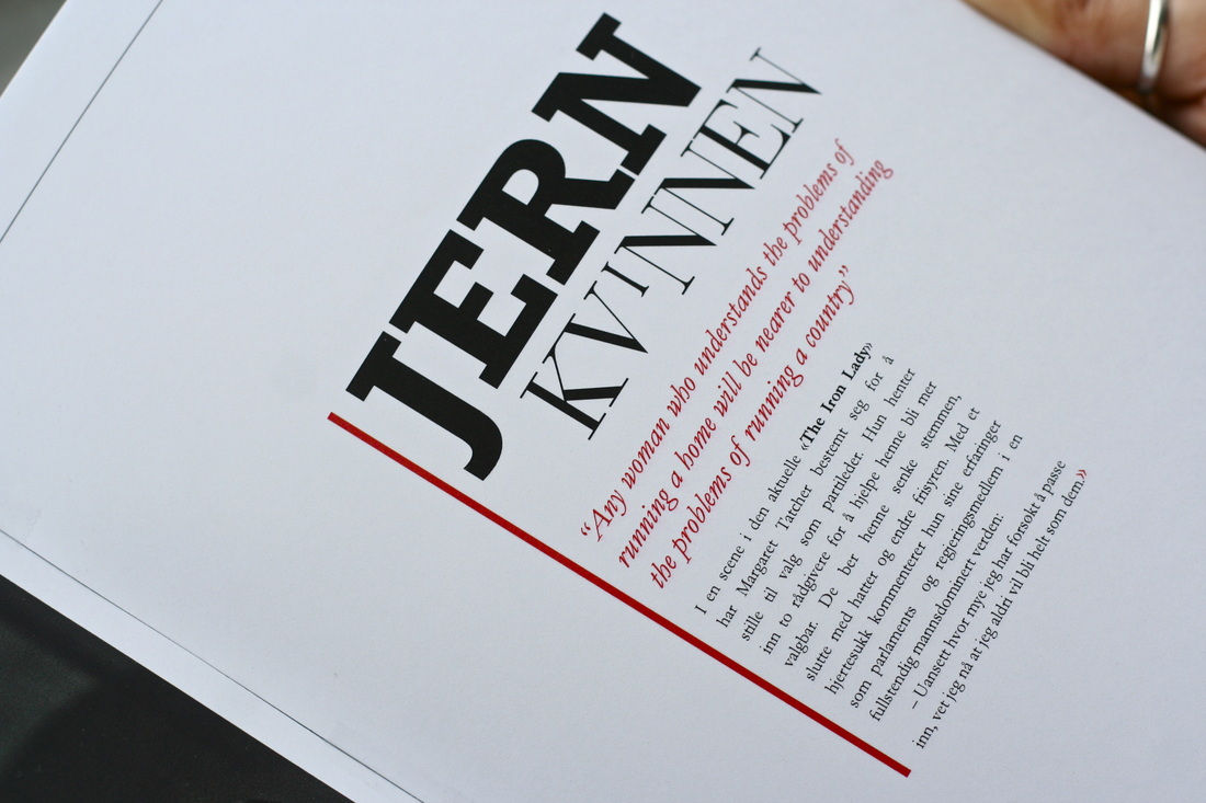
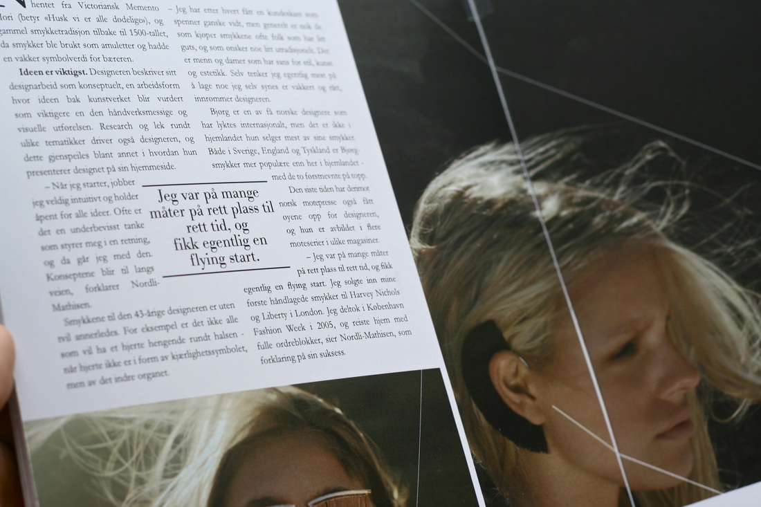
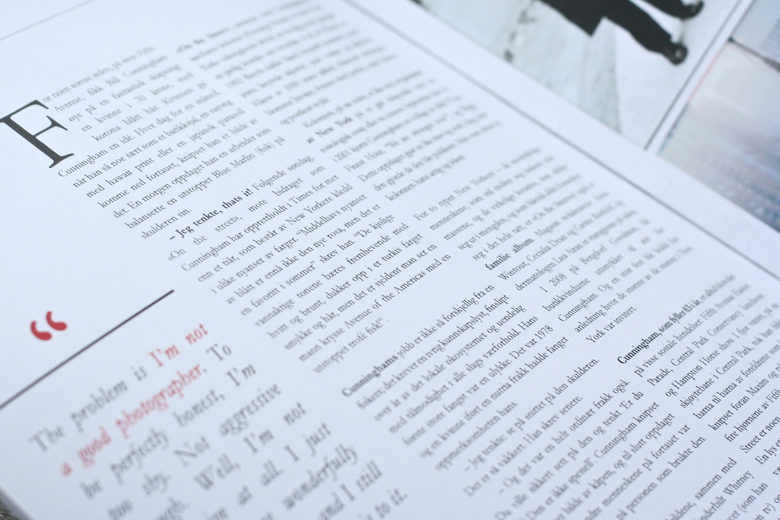
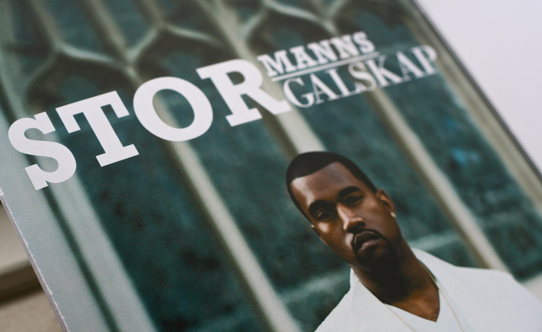
I made a fictional magazine for women called ”klisjé”. My core values were feminine, strong, creative, innovative and trendy. My research question was: how can I create a new magazine that will stand out from other magazines in its genre? And how to make the target group want to switch it with their regular magazine?

The task was to create a calligraphic word or sentence with the use of ink and the techniques we had learned during our calligraphic course. I wrote the sentence “om mani padme hum”, which is a Tibetan Buddhist mantra.

